

Introduction
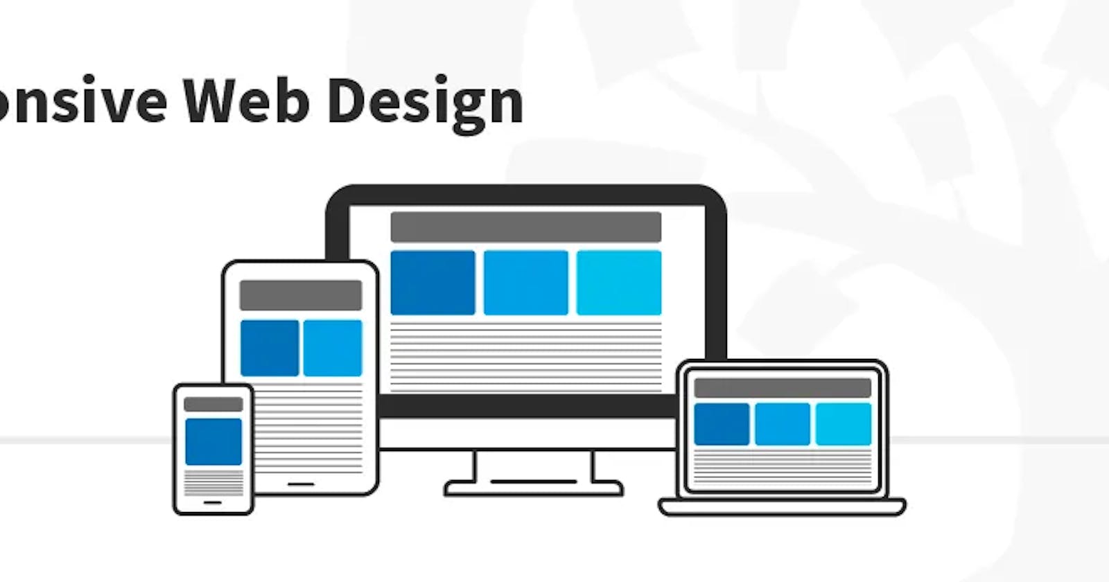
Responsive design is an approach to web design that aims to provide a seamless user experience across a wide range of devices and screen sizes. It allows websites to adapt to different devices and resolutions, making sure that content is displayed in a clear and readable way, no matter what device is being used to access it.
In this article, we'll look at how to create a responsive design using HTML, CSS, and JavaScript. We'll cover the basic principles of responsive design, as well as some advanced techniques for creating truly flexible and dynamic layouts.
Basic Principles of Responsive Design
The basic principles of responsive design involve creating a flexible and adaptable layout that can adjust to different screen sizes and resolutions. This is achieved by using a combination of HTML, CSS, and JavaScript to create a responsive design that responds to changes in the size and orientation of the device being used to access it.
One of the key components of responsive design is the use of media queries.
What are Media Queries
Media queries are a feature of CSS that allows you to specify different styles for different devices and screen sizes. You can use media queries to adjust the layout, font sizes, paragraphs, Heading, images and other design elements based on the device being used to view the site.
Another important component of responsive design is the use of flexible grids. A flexible grid is a layout that can adjust to different screen sizes by using percentages or other relative units of measurement. This allows the layout to expand as needed to fit the available screen space.
Creating a Responsive Design
Let's take a look at how to create a basic responsive design using HTML, CSS, and JavaScript. We'll start with the HTML:
<!DOCTYPE html>
<html>
<head>
    <meta charset="UTF-8">
    <title>Responsive Design</title>
    <link rel="stylesheet" href="styles.css">
</head>
<body>
    <header>
        <h1>Responsive Design </h1>
        <nav>
            <ul>
                <li><a href="#">Home</a></li>
                <li><a href="#">About</a></li>
                <li><a href="#">Contact</a></li>
            </ul>
        </nav>
    </header>
    <main>
        <section>
            <h2>Section 1</h2>
            <p> A responsive Design created with html, css and javascript</p>
        </section>
        <section>
            <h2>Section 2</h2>
            <p> A responsive Design created with html, css and javascript</p>
        </section>
        <section>
            <h2>Section 3</h2>
            <p> I love Writing</p>
        </section>
    </main>
    <footer>
        <p>Copyright © 2023</p>
    </footer>
    <script src="script.js"></script>
</body>
</html>
The above HTML template includes a header, main content, and footer. We've also included links to an external stylesheet and JavaScript file.
Next, let's take a look at the CSS:
/* Basic Styles */
body {
    margin: 0;
    padding: 0;
    font-family: Arial, sans-serif;
    font-size: 16px;
}

/* Header Styles */
header {
background-color: #333;
color: #fff;
padding: 20px;
}

header h1 {
margin: 0;
}

header nav ul {
margin: 0;
padding: 0;
list-style: none;
display: flex;
}

header nav li {
margin-right: 20px;
}

header nav a {
color: #fff;
text-decoration: none;
}

/* Main Content Styles */
main {
padding: 20px;
display: flex;
flex-wrap: wrap;
}

section {
flex: 1 1 300px;
margin-right: 20px;
margin-bottom: 20px;
}

section:nth-child(3n) {
margin-right: 0;
}

h2 {
margin-top: 0;
}

p {
margin-bottom: 0;
}

/* Footer Styles */
footer {
background-color: #333;
color: #fff;
padding: 20px;
text-align: center;
}
Now that we have our HTML and CSS in place, let's add some JavaScript to make our design truly responsive. We'll use the matchMedia() method to detect changes in the screen size and adjust the layout accordingly.
// JavaScript
let mq = window.matchMedia("(min-width: 768px)");

function handleViewportChange(e) {
    if (e.matches) {
        main.style.display = "flex";
    } else {
        main.style.display = "block";
    }
}

mq.addListener(handleViewportChange);
handleViewportChange(mq);
In the above JavaScript code snippet, we use the matchMedia() method to create a media query that targets screen sizes with a minimum width of 768 pixels. We then define a function called handleViewportChange() that will be called whenever the screen size changes.
Inside the handleViewportChange() function, we check the value of e.matches, which will be true if the media query matches the current screen size. If the media query matches, we set the display property of the main element to "flex", which will activate the flexible grid we defined in our CSS. If the media query does not match, we set the display property to "block", which will cause the main element to be displayed as a block-level element with a fixed width.
Conclusion
In this article, we've explored the basic principles of responsive design and demonstrated how to create a responsive design using HTML, CSS, and JavaScript. By using media queries and flexible grids, we can create a design that adapts to different screen sizes and provides an optimal user experience across a wide range of devices.
With a little bit of JavaScript, we can take our responsive design to the next level and create a truly dynamic and flexible layout that can adjust to any screen size or orientation.
Thanks for Reading and I hope you found it helpful.
consider following me on TWITTER.